I remember getting my report cards as a child. Report cards could be either good or bad, and sometimes they were just ugly. From an IT perspective, good reports, bad reports, and ugly reports are defined much differently.
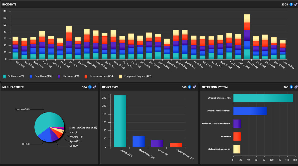
At face value, a report can appear to be a good report. It might contain beautiful graphics in 3-D with beautiful colors highlighting important data relevant to the non-IT business managers throughout an organization. However, if the data in the report is inaccurate, irrelevant, or skewed, then you might not have a good report.
Reports are a way for ITSM and ITAM managers to add value to an organization. Reports should contain unbiased data that reveals a summary of IT’s performance and how that information translates into the non-IT business units. How can you differentiate the good reports from the bad reports? Are you creating ugly reports that need a makeover?
Good ITAM & ITSM Reports
Do unfavorable results displayed in a report make it a bad report?
From an IT perspective, the report is only bad if it is inaccurate or irrelevant. For example, from an IT perspective, my bad report card would be a good report if the data is accurate. Unfavorable results often lead to positive change and progress. Good reports should point out areas for improvement.
Good ITAM and ITSM reports can show you favorable information which confirms that you are making the right business decisions, or unfavorable information that helps you identify areas for improvements. The key factors that make a good report includes data that is accurate, complete, and easy to interpret and understand.
Good reports can also build trust between IT managers and non-IT managers. If you provide just one bad report, you might lose trust from your non-IT business managers and from their perspective, all your reports will be bad reports. Trust is not easily gained and can be lost with a single bad report. Showing consideration for your workforce is a sign of excellent leadership. That level of leadership is normally obtained through some form of leadership coaching.
With good ITAM and ITSM reports, business executives will be able to make informed decisions regarding IT purchases and organizational structure. They will also see where investment is needed with regard to software and hardware tools, or employee training that might be required to reduce service calls.
Bad ITAM & ITSM Reports
Bad reports cannot be trusted. They either contain inaccurate data or they omit relevant data; therefore, giving you inconclusive or inaccurate results. To turn a bad report into a good one, the data in the database has to be analyzed. The database has to be normalized and contain the information needed to produce the results for the report.
Are the right people getting the right reports?
Bad reports might only be bad because they contain data that is irrelevant to the non-IT business manager receiving the report. Be sure to understand the objectives of different business managers within the organization. Align the reports to their objectives.
Are you biased?
Omitting relevant information or presenting it in such a way that the results are skewed or easily misinterpreted, results in bad reports. Be sure you are not trying to persuade the organization’s policy or decisions with skewed reports because of personal opinion or agendas.
For example, the helpdesk manager might not be meeting the SLAs that have been contracted by the organization, so he/she determines that more analysts are needed. However, a report might show the problem is something else, such as inadequate software tools or lack of training. Let the reports show the results without a personal agenda based on personal opinion. You might not like what the reports are showing, but that doesn’t make them bad reports. Skewed results make bad reports.
Bad ITAM and ITSM reports can lead to bad executive decisions. For example, if ITSM reports are not indicating why SLAs are not met, the decision makers might not be able to address the problem. Not addressing areas of improvement or success can lead to poor decisions which will cost an organization money.
Ugly ITAM & ITSM Reports
Ugly reports are reports that have a problem communicating the message you want to convey. They might contain irrelevant data, unnecessary charts, data that needs to be interpreted, or too much data that clouds the message. The good news is that ugly reports can be modified. If you have the right tools, ugly reports can be turned into good reports.
Do you have to explain the report?
Ugly ITAM and ITSM reports are difficult for non-IT business managers to understand. For example, an ITAM software report might indicate that the organization purchased too many licenses of a software package based on a software usage report that shows only 10% of the employees are using the software. Although an executive might find this information to be troubling, the executive might not apply the appropriate urgency to the issue without a dollar amount included in the report. Showing cost, revenue, and risk to executives can turn an ugly report into a good report.
If you have to explain or interpret the results in your report to the non-IT business managers, you have an ugly report.
Suggestions for Creating Good Reports
- Add data intelligence tools to your IT portfolio that allow you to normalize IT data and map IT data contained in your databases. This will help ensure the data you are providing to the reporting tools is accurate and relevant.
- Choose the right reporting tools. The software tools you are using should never be an obstacle in creating a good and meaningful report. If the reporting tool is difficult to use, find something else.
- Choose reporting tools that allow you to report from multiple databases so that you can cross reference your findings. Reporting tools designed to report on one software solution or database are not sufficient when creating Business Value Dashboards (BVDs).
- Choose reporting tools that allow you to create meaningful dashboards; however, don’t overdo it. Avoid using animation or unnecessary graphics. Too much information makes an ugly report.
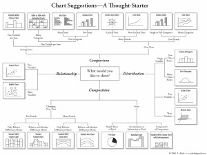
- Understand how and when to use a pie chart, bar graph, line graph, area graph, or an X-Y plot. Using the wrong graph can make your report confusing which turns a good report into an ugly or bad report.
Summary
My advice for identifying good reports is as follows:
Some good reports are bad, some bad reports are good, and some reports are just plain ugly. So how do you determine the good, from the bad, from the ugly? As mothers have said for many generations, “It’s what’s on the inside that really counts.”
-follow me on Twitter @marcelshaw

